H55 / Rabbit
2002
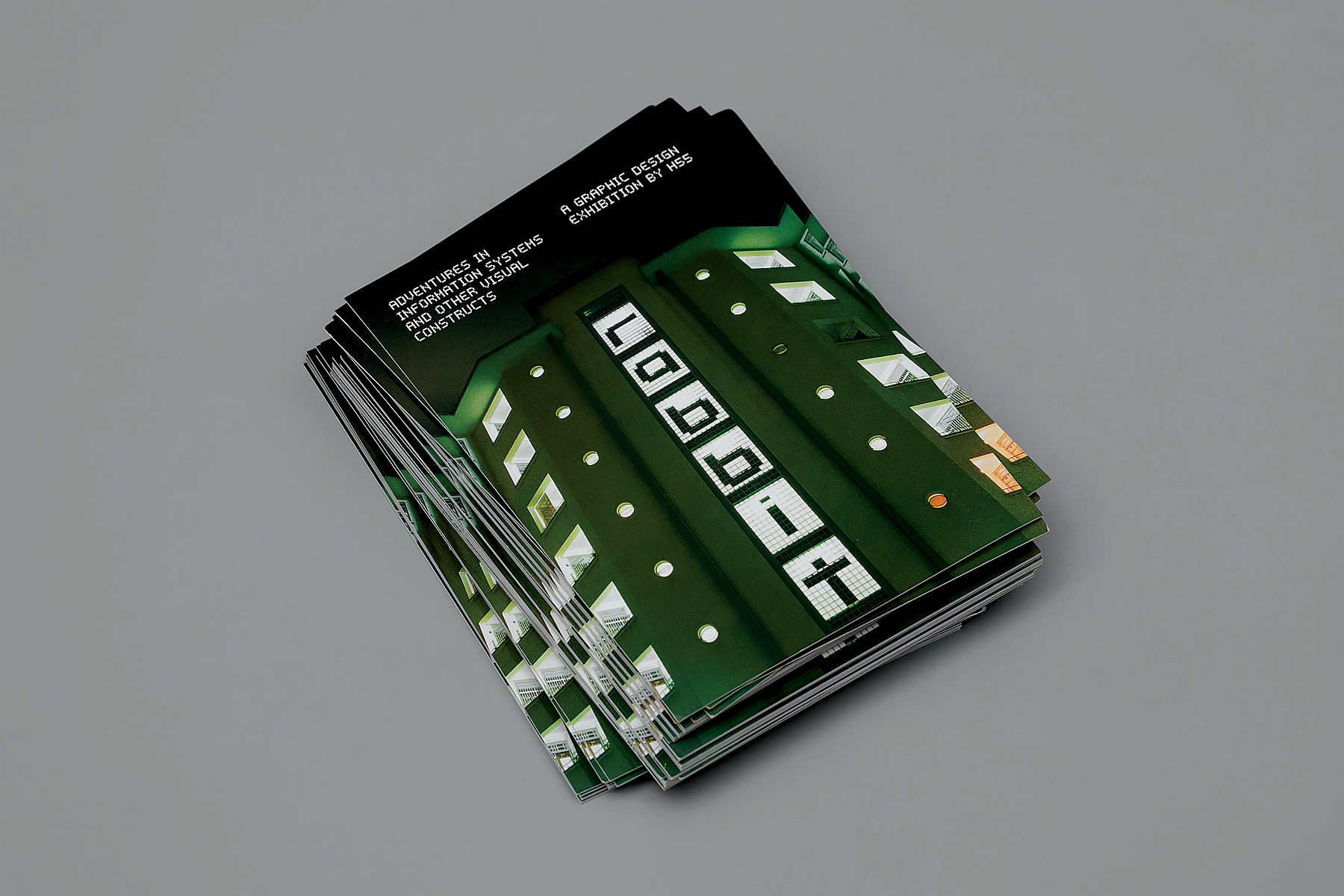
‘Adventures In Information Systems and Other Visual Constructs’ is a graphic design exhibition, showcasing H55’s ideas in progress and process explorations, many of which were later adapted for commissioned works.
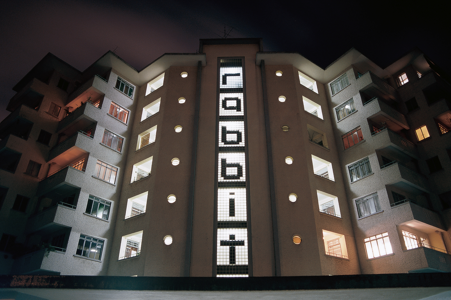
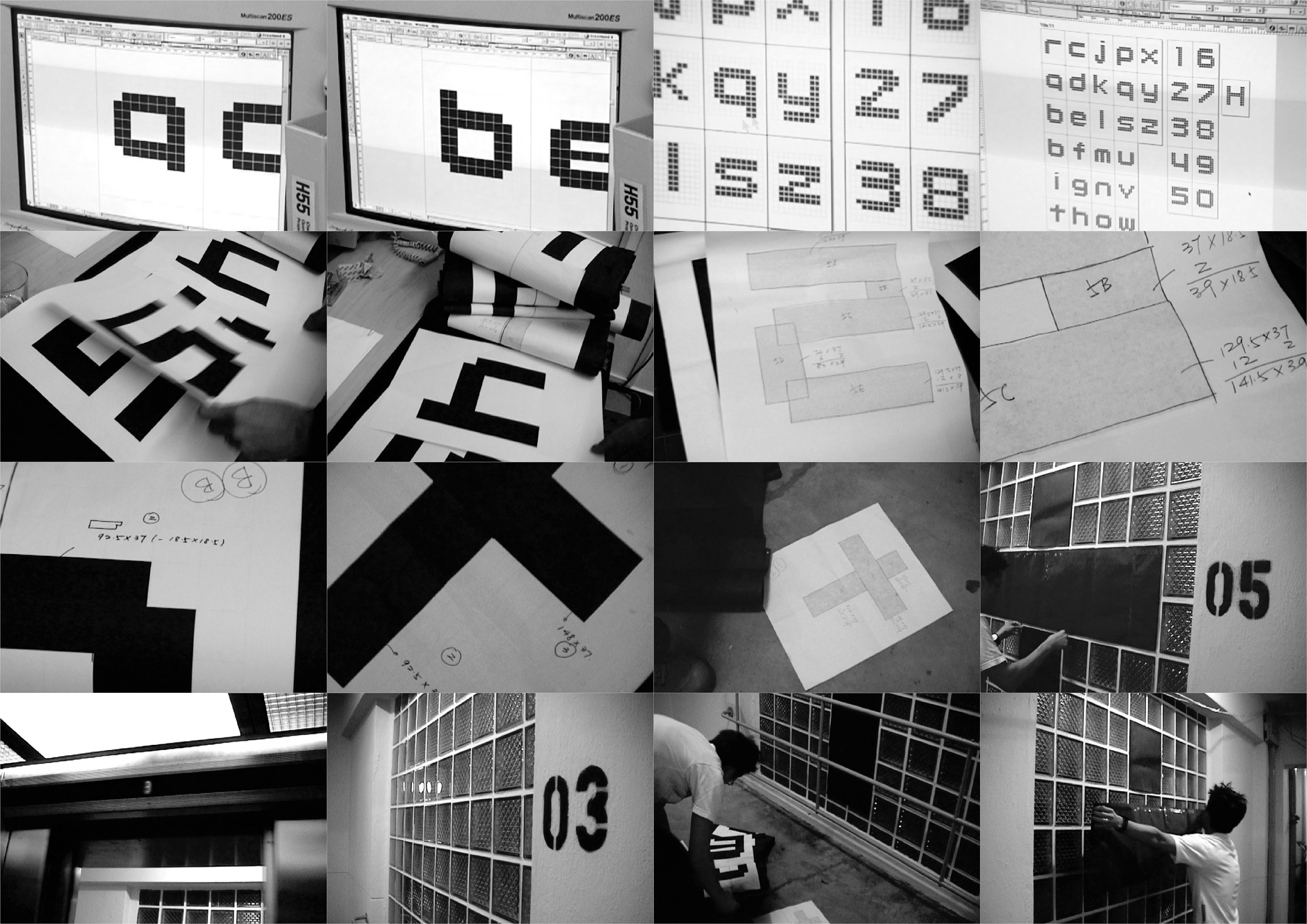
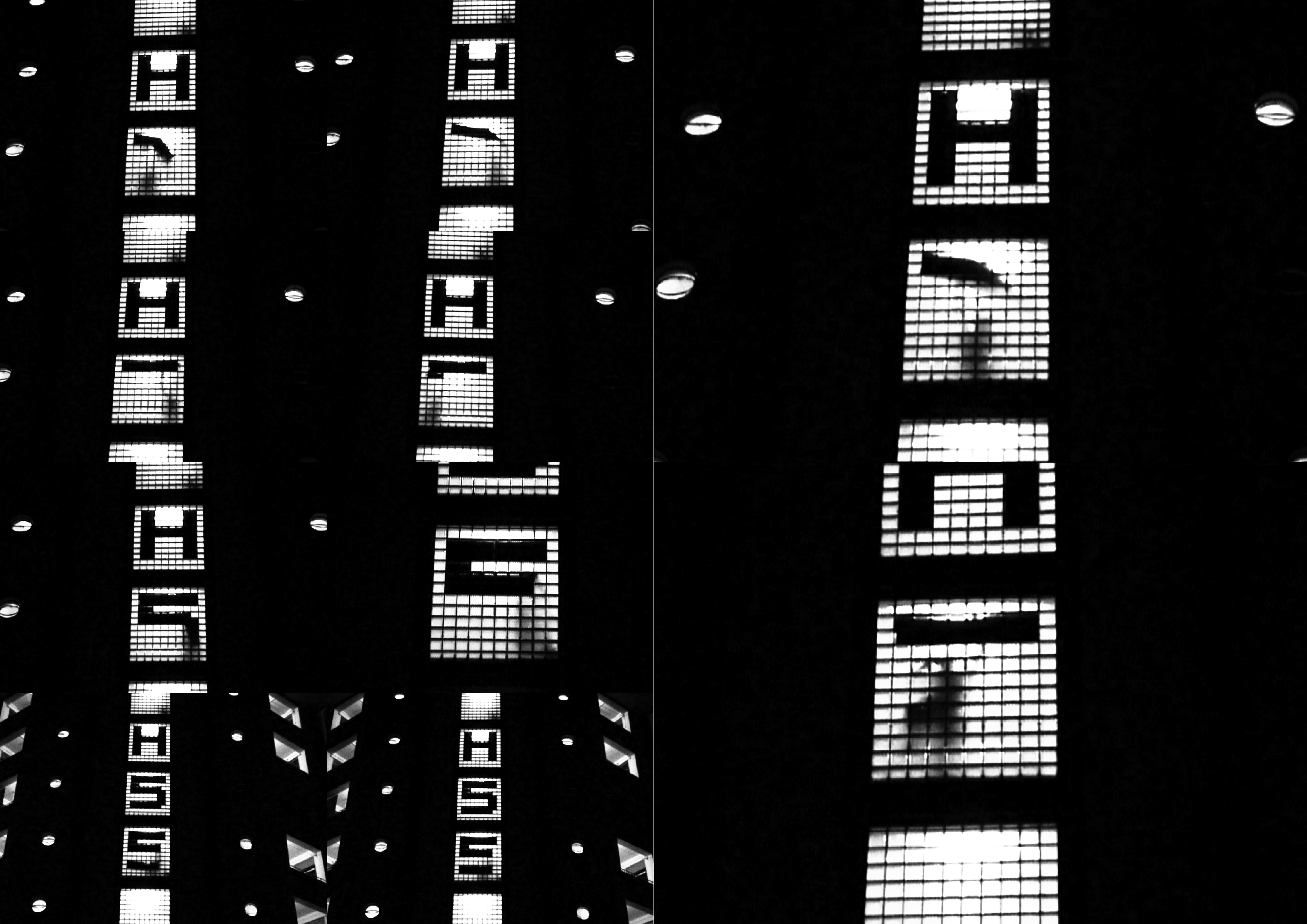
The exhibition’s identity was created out of a need for a directional sign to help exhibition guests navigate the studio on the opening night. In the end, it was decided that the entire building in itself should be made into a signage. This was achieved by placing black paper strategically over the illuminated glass blocks at each floor’s lift lobby, using its grid to form letters that could be read from a distance away.
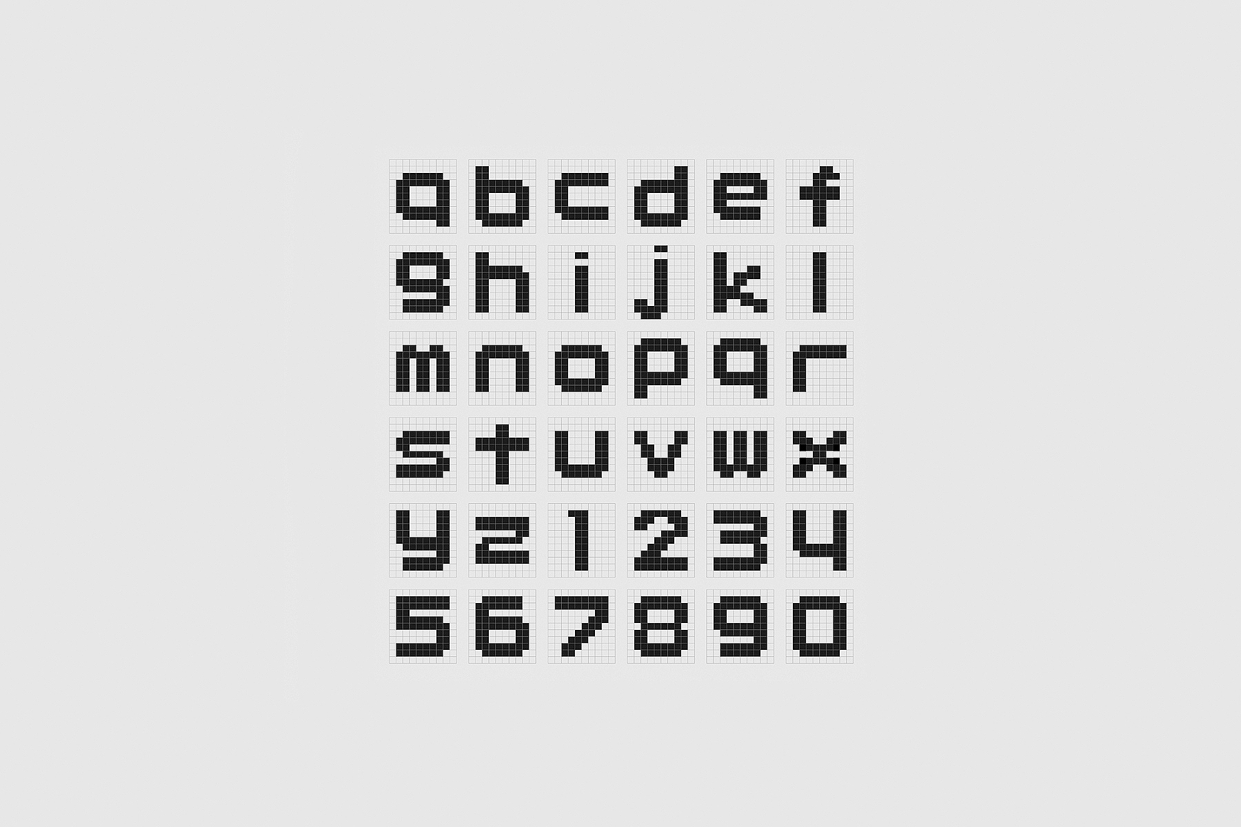
Partly as a counter-response to the technology-inspired pixel-art fad at the time, these low-tech ‘dot matrix’, typographic installations of ‘H55’ and ‘RABBIT’ were photographed and used as the visual identity for the exhibition posters and invitation cards. An existing ‘pixelated’ typeface was selected for the body copy so as to complement the typographic installation.
The installation was put up again on the opening night to dispel the myth that the typography on the building seen on the posters and invitation cards was added digitally. This impressed many of the guests from afar and made it appear as if H55 owned the entire building.
