The Sandwich Shop
2003
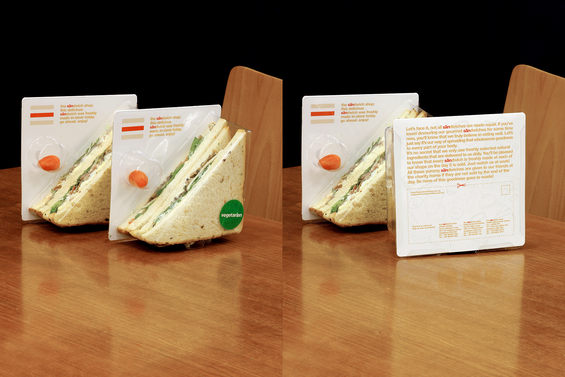
Besides representing a sandwich, the Sandwich Shop’s logo is derived from the mandarin character ‘san’ (for ‘san wen zhi’, which is mandarin for sandwich), in response to the initial design brief to incorporate an East-West element into the identity.
Interestingly, the same Chinese character, ‘san’, also means ‘three’, which is logical as a sandwich is essentially made up of three layers.
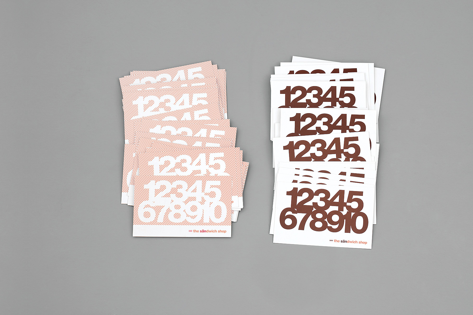
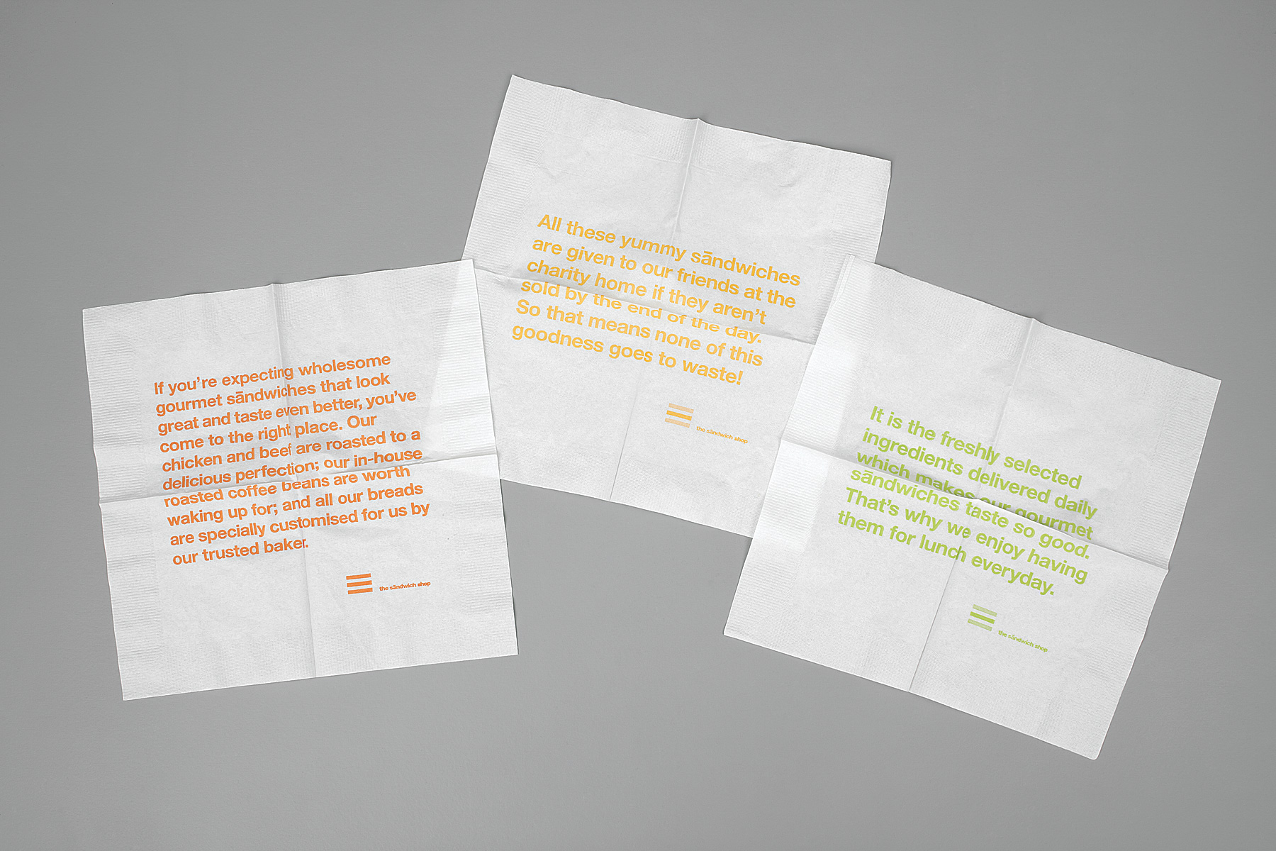
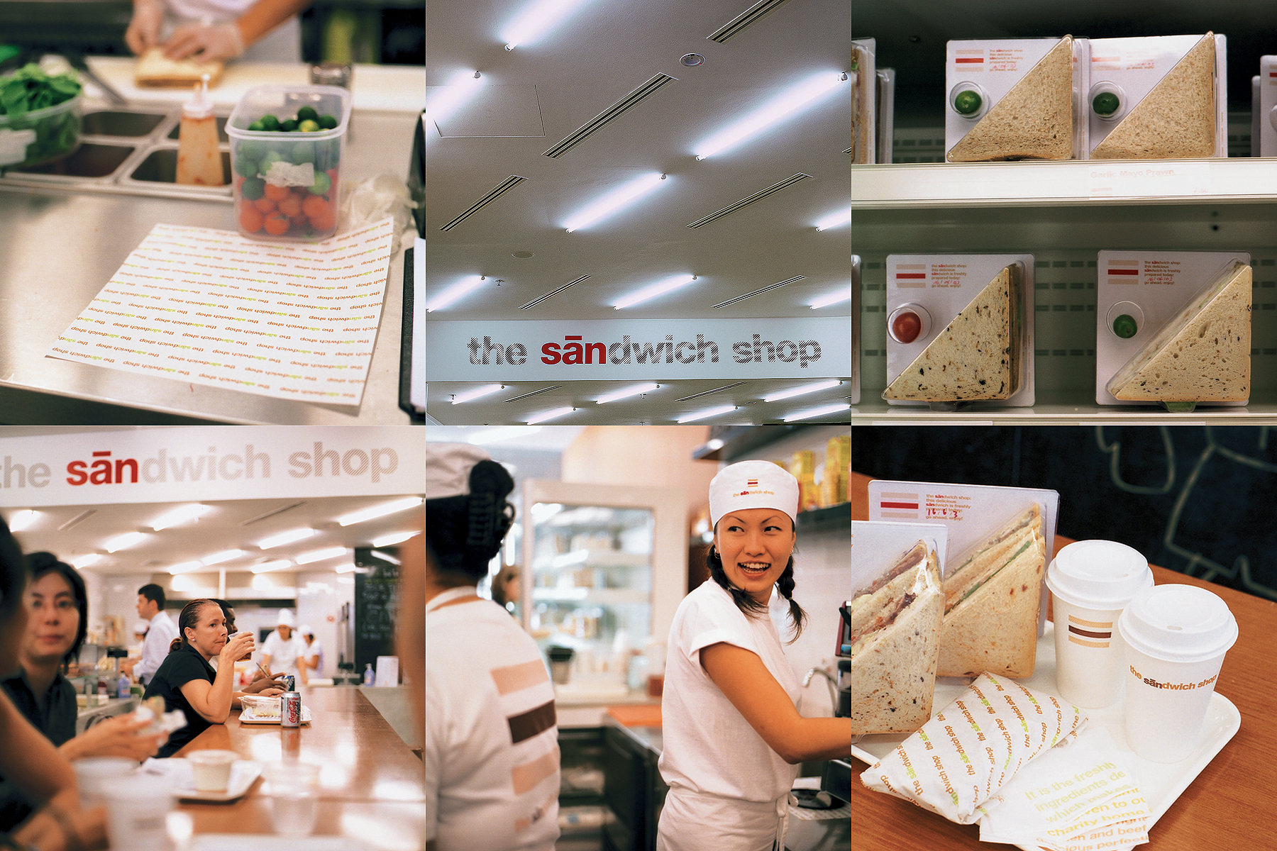
The overall identity is honest, clear, systematic and void of superficiality, appropriately reflecting the ethos of The Sandwich Shop.


